Lifts have truly changed from only moving us up and down in towers. Now, they are a major part of how a place seems and is. One thing that often gets left out? The lift button, which strongly affects both the look and the feeling of using the lift. Let’s explore how today’s lift buttons are altering the mood of buildings and why they really count more than you may believe!
Table of Contents
Toggle5 Latest Trend in Lift Button & How They Boost the Look
Elevator buttons are now actually cool design features that fit right into today’s architecture. Check out some of the newest trends and see why these little details are a big deal.
1. Minimalist and Sleek Designs
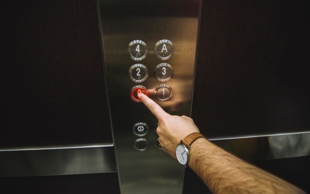
Have you noticed how neat and plain styles are showing up all around? Elevator buttons are same. In today’s sleek places, they’re getting more chic and simple.
- Flush-Mounted Or Recessed Buttons: First up, these buttons lay nice and even against the lift wall, giving it a smooth, new feel that match right in with the building’s whole design..
- Premium material Elevator Button: Next, designers are picking things like shiny metal, clear glass and soft plastic. Not only do they look nice but they feel good to touch.
- Backlit panels: Finally, a small glow behind the keys not only looks nice but also makes it really simple to press the correct one, no matter how light or dim it is.

This style is good for making any place feel like a new, futuristic, fancy, up-to-date space!
2. Customizable Button Layouts
Customization is a big trend in design, and elevator buttons are getting in on it too. Now, you can set up button layouts that match the building’s look, turning them into stylish design features.
- Flexible Configurations: Designers can now arrange buttons in all kinds of creative ways to fit the building’s style.
- Branded Designs: Some buildings take it further by adding logos or unique colors to the button designs.
- Variety of Shapes and Finishes: You can also choose from round, square, or even hexagonal buttons with finishes like metallic, matte, or glossy for a truly personalized look.
This trend gives architects the chance to make the elevator stand out or blend in perfectly with the building’s overall design.
3. Interactive Displays
Elevators are getting a big upgrade with interactive displays becoming common. Instead of old buttons, imagine a touchscreen that provides all sorts of information while you wait—pretty cool, right?

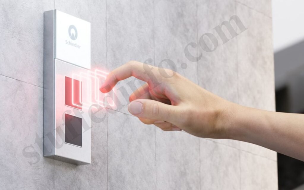
- Contactless Elevator Button: In the world of AI, elevator buttons have also gone one step ahead. The contactless elevator buttons are both futuristic and trendy.
- Building information at your fingertip: Firstly, these displays can show directories, floor maps, and real-time updates, helping you find your way easily.
- Additional Services: Additionally, they can also give you alerts, security info, and other important updates while you choose your floor.
- Better user experience: Overall, these interactive features make riding the elevator feel smoother and more user-friendly.
This trend is all about making your elevator ride more enjoyable and tech-savvy.
4. Accessibility-Focused Designs
Making designs accessible isn’t just an afterthought anymore—it’s a top priority these days. Elevator buttons are getting a friendly makeover so that everyone can use them easily.
- Larger, easy-to-press buttons: First off, bigger buttons make it a lot easier for people with limited mobility to hop on the elevator.
- Braille And Tactile Labels: On top of that, you’ll find Braille and tactile labels to help those who can’t see well find their way without any hassle.
- Voice controls: Plus, some high-tech elevators let you just say the floor number, so you don’t even have to press a button.
- Audio Cues: And let’s not forget about sound signals! They give audio cues to help visually challenged riders get around safely.
These features ensure that elevators are user-friendly and accessible for everyone.
5. Sustainable and Energy-Efficient Options
As the world moves toward being more eco-friendly, elevator button designs are starting to embrace green materials and energy-efficient technology.
- Recycled materials: First up, many buttons are now made from recycled metals or plastics, which really helps reduce waste and protect the environment.
- Energy-saving LED lights: On top of that, LED lights used for button backlighting use less energy and last much longer.
- Low-energy button systems: Finally, some button systems are designed to use very little energy, which lowers the overall energy consumption of the elevator.
These eco-friendly options are perfect for building owners who want to combine style with a commitment to taking care of the planet.
Does Elevator Push Button Distance From Elevator Make Any Difference?
Believe it or not, the elevator push button distance from elevator can make a big difference in both usability and aesthetics. Here’s why it matters.
A. Enhancing Accessibility and Aesthetics
To start off, putting the buttons at a good distance means they’re super easy for everyone to reach. This will thus even help those who might have some difficulty moving around. Plus, when the buttons are in the right spot, it makes the elevator area look neat and classy.
B. Safety and Comfort Through Design Integration
Another thing, by placing the buttons at just the right distance from the elevator doors, we avoid any jamming up, This will consequently make it way easier and safer for everyone to get in and out.
C. Seamless Integration with Architectural Elements
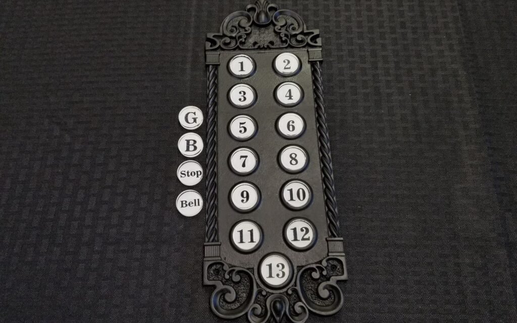
Last but not least, when the buttons are carefully positioned, they fit right in with the overall vibe of the building. This will in turn help in adding to the aesthetic and atmosphere of the area. For instance a vintage look elevator button will go well with classic theme buildings.

Conclusion
To sum up, the design of elevator buttons has really evolved over time. Now, it’s not just about reaching your floor; instead, it’s about adding a smooth and stylish touch that boosts the vibe of the building. Thus, nowadays, elevator buttons are, in fact, a major element of modern architecture. Additionally, don’t overlook the fact that the elevator push button’s distance from the elevator is, indeed, super important for making the whole experience both user-friendly and nice to look at.
FAQs
What are the latest trends in elevator button design?
The latest trends include sleek minimalist designs, customizable layouts, interactive displays, accessibility features, and sustainable options.
How does the distance of elevator buttons affect the user experience?
The distance of the elevator buttons from the elevator influences accessibility, safety, and the overall design of the space.
Why is aesthetics important in elevator button design?
A well-designed elevator button panel can enhance the building’s look, making it more visually appealing and functional for users.


